MiGo was a case developed as an evaluative part of my UX Design course. The challenge was to create a insurance solution for cyclists and their bicycles where I would apply all the lessons learned from the UI and Mobile Developent Modules, such as building a coherent visual identity that considers accessibility guidelines.
As a result I developed a visual identity that prioritizes high contrast between colors and elements, as well as a simple to use interface with clear and direct information for the user.
Project Goal
Create an app for a bicycle and cyclist insurance company that provides reliability to the users and solves their main pain: the fear of being robbed. The app should allow the visualization of information about the insurance, so the user could to understand what would or would not be included, it should give a lot of emphasis to the action of activating the insurance, and general information about the user’s plan, to demonstrate transparency and security in communication.
Prototypes
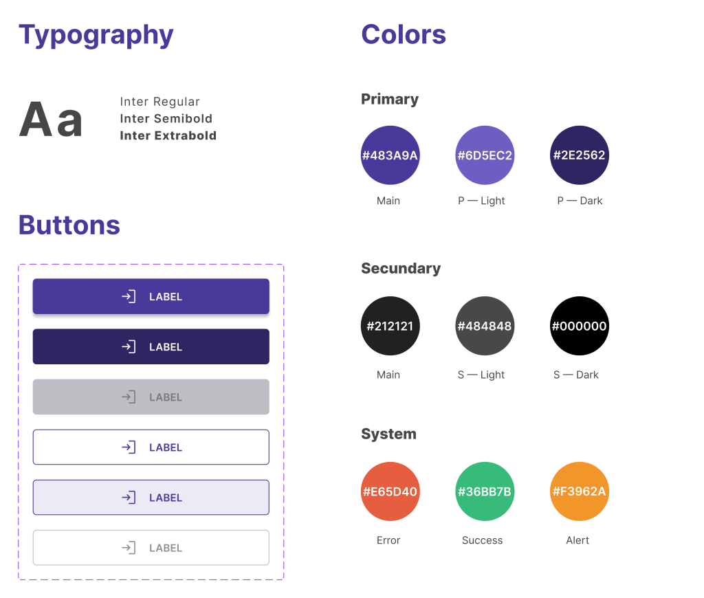
High-fidelity prototypes present a simple and easy experience. Colors are highly contrasted according to accessibility guidelines (AA and AAA), font size and use of white spaces also make for a pleasant reading experience. The height and width of the buttons, as well as the click area of the icons also comply with usability standards.

All content used here is free for non-comercial use.
High Fidelity Prototype
You can check the prototypes at this link! 😉
