
Compartir is a peer-to-peer bike rental solution designed for individuals to share their bikes and their experiences with cycling. It was developed as my final project for my UX/UI Design course at Mentorama. Following the bike sharing market trend, Compartir offers a platform for people to share their own bicycles in a more communal and eco-friendly manner. Its unique feature is that it allows users to rent a customized bike of their choice, instead of standardized bikes with minimal features typically offered by companies. The result was the development of an app where individuals can register both to share their bikes and to rent from those who are sharing.
Problem
The solution aims to address, in a balanced manner, our users’ two main needs: saving time and money while commuting from home to work and promoting cycling as a viable option for the city of São Paulo. Our users are young cyclists from this city who wish to commute faster to work, but also believe that the bicycle is an environmentally friendly mode of transportation that needs to be more valued. We started from the specific needs of our defined persona to offer a solution that allows, at the same time, saving/earning money with the bike and connecting with other people who want to promote cycling.
Persona

Solution
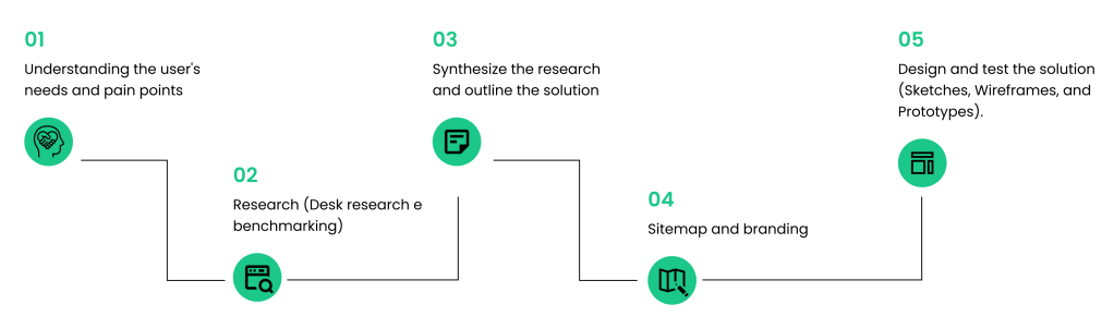
To reach this solution, we initially invested in research that could provide reliable data for better decision-making. The starting point was the creation of a CSD matrix to diagnose our certainties, assumptions, and doubts on the subject. The matrix helped formulate questions that guided the next stage of the process: user research. From it, we defined 8 questions to be answered by the interviewed users. These questions were centered around two main axes: motivations and challenges of cycling; motivations and challenges of sharing a bicycle. We interviewed 4 people living in São Paulo who either currently or previously commuted by bicycle in the city. The result of these interviews was synthesized into keywords, summarizing the main points that emerged from the respondents’ statements. This phase was crucial to understand that one of the pain points that needed to be addressed was the issue of safety; therefore, the solution needed to offer insurance to the users.
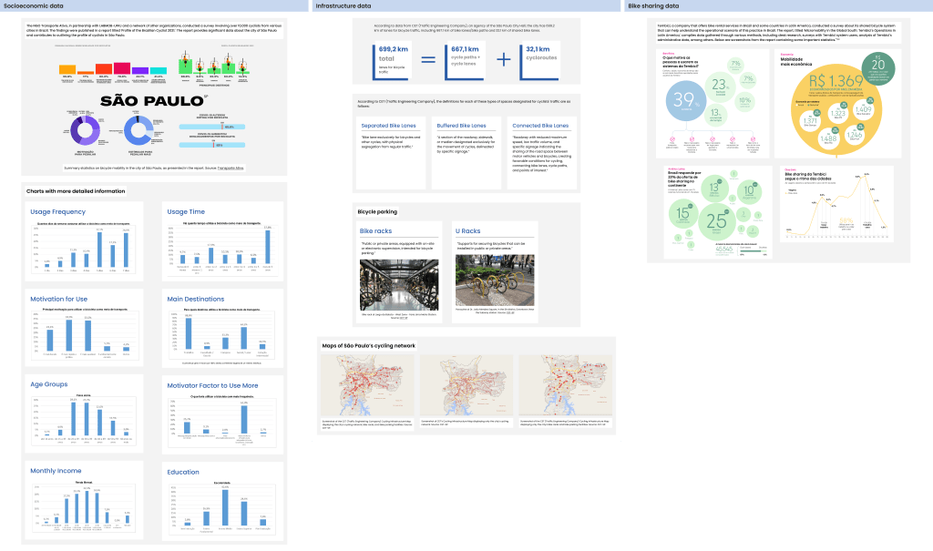
In parallel with the interviews, we also conducted desk research. Data were collected about the city’s cycling infrastructure, such as the size of the cycling network and the availability of bike racks and bike parking facilities. We also gathered socioeconomic data to understand who the people cycling in São Paulo are and why they do so. Finally, we collected some data from the largest bike-sharing service available in the country to understand the current scenario of this type of service. Additionally, we conducted benchmarking to understand the existing companies in the market and what they offer. After the research phase, we synthesized all the gathered data using two methodologies: How might we (HMW) and Affinity Grouping. Then, we brainstormed ideas and finally arrived at a solution outline.
Process
CSD Matrix
To reach this solution, we first invested in research that could provide reliable data for better decision making. The starting point was the creation of a CSD matrix to diagnose our certainties, assumptions and doubts on the subject.

Interviews
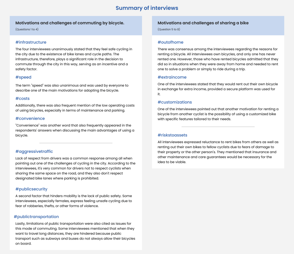
The matrix helped formulate questions that guided the next stage of the process: user research. Based on it, we defined 8 questions to be answered by the interviewed users. These questions were centered around two main axes: motivations and challenges of cycling; motivations and challenges of bike-sharing. We interviewed 4 people living in São Paulo who either currently or previously commuted by bicycle in the city. The result of these interviews was synthesized into keywords, summarizing the main points that emerged from the respondents’ statements. This phase was crucial to understand that one of the pain points that needed to be addressed was the issue of safety; therefore, the solution needed to offer insurance to the users.
Research
In parallel with the interviews, we also conducted desk research. Data were collected about the city’s cycling infrastructure, such as the size of the cycling network and the availability of bike racks and bike parking facilities. We also gathered socioeconomic data to understand who the people cycling in São Paulo are and why they do so. Finally, we collected some data from the country’s largest bike-sharing service to understand the current landscape of this type of service. We also conducted benchmarking to understand the existing companies in the market and what they offer.
Solution outline
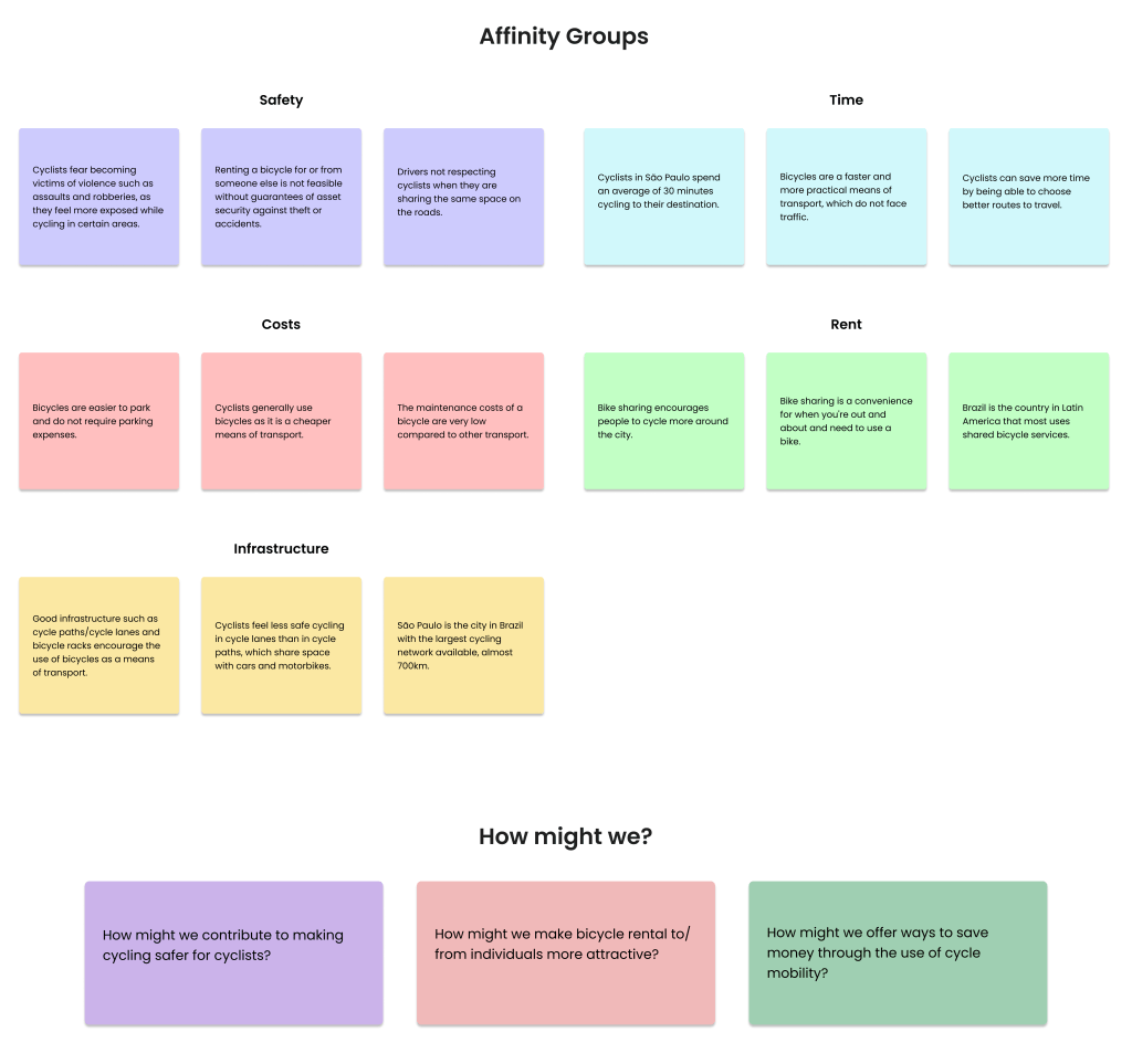
After the research phase, we synthesized all the data gathered using two methodologies: How might we (HMW) and Affinity Group. Then we brainstormed ideas and finally came up with a sketch of the solution.
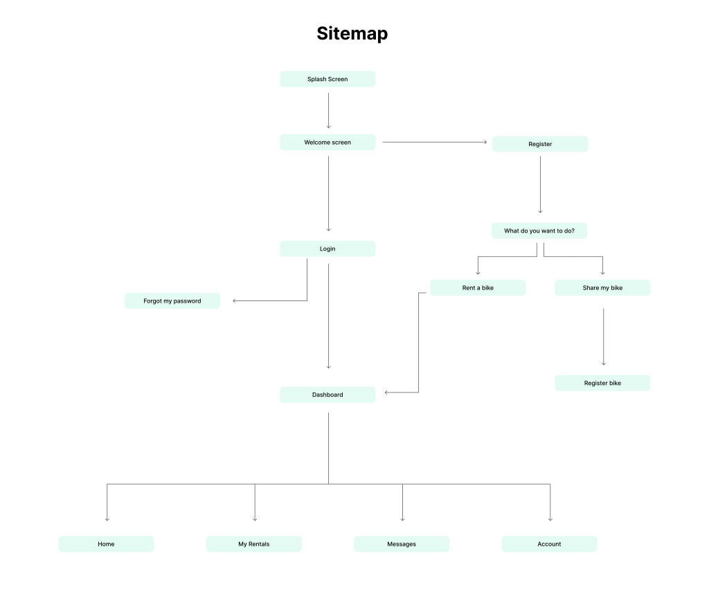
Sitemap
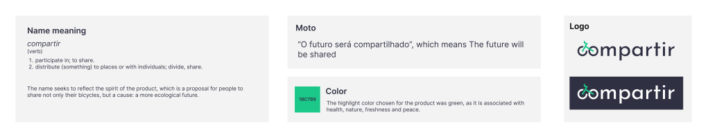
Branding
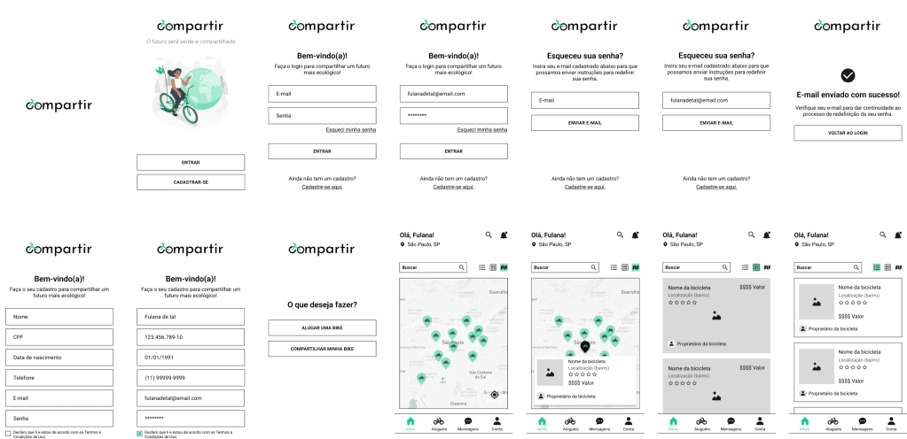
Wireframes e testes
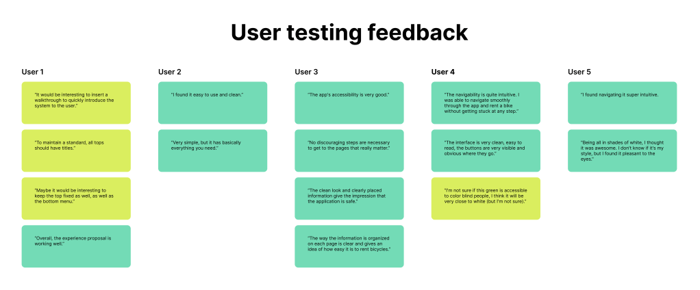
Unmoderated tests were carried out with 05 users. Users were asked to try to perform basic tasks such as logging in, registering, setting a password, searching for a bike, registering a bike, etc.
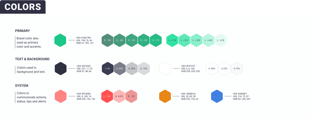
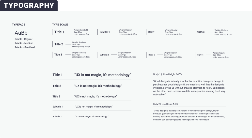
Style Guide
Design Decisions
Decision 1
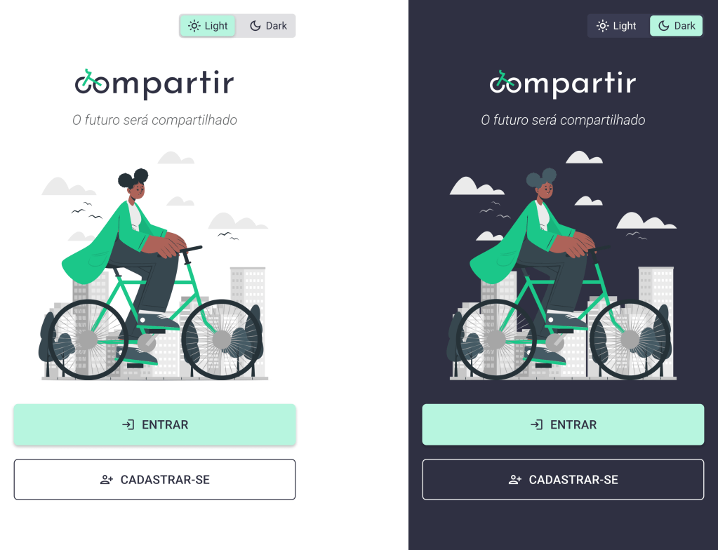
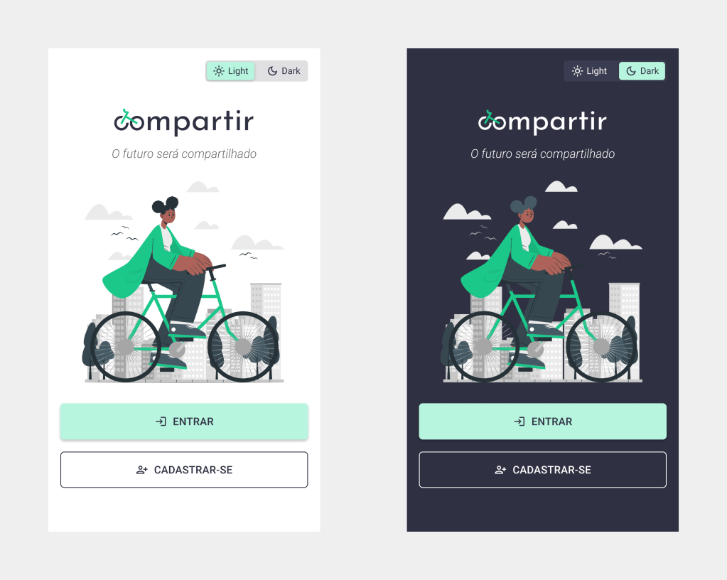
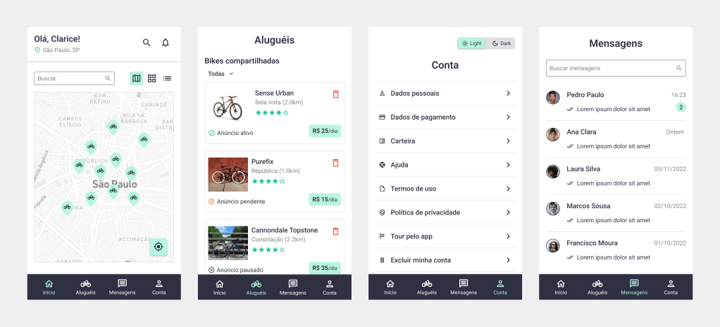
Also create a “Dark Mode” interface to offer the user the flexibility to switch to an interface that causes less eye fatigue and saves more battery.
Decision 2
Offer a walkthrough for FTU (First Time Users) to help them navigate the app when logging in for the first time.

Decision 3
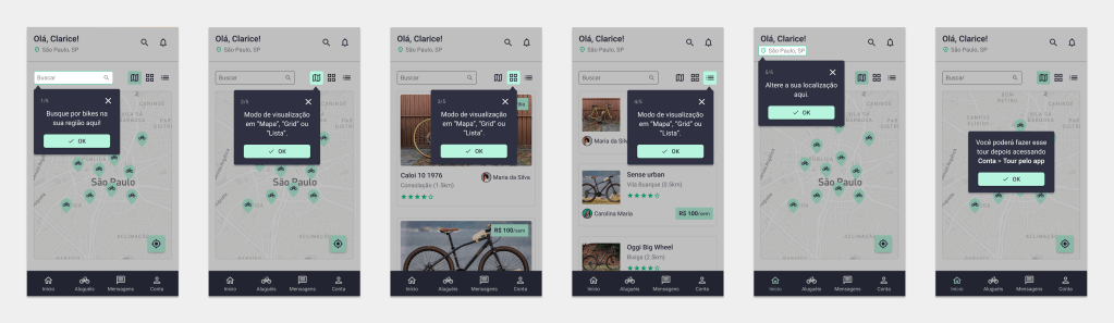
Three ways to view bicycles available for rent: map, cards and list. This allows the user to choose the viewing method that works best for their needs. Nielsen’s heuristic n.7: Flexibility and efficiency of use.
Decision 4
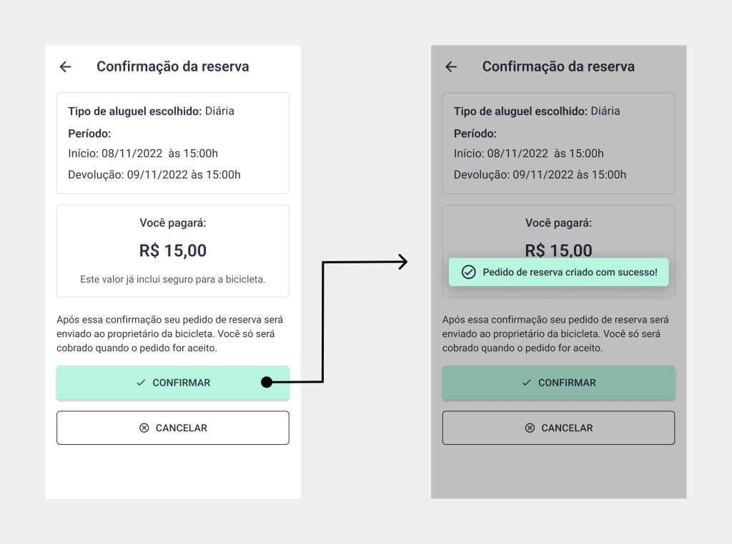
Constant feedback on what the system is doing, so the user can monitor the results of their actions. Nielsen’s heuristic n.1: Visibility of system status.
Decision 5
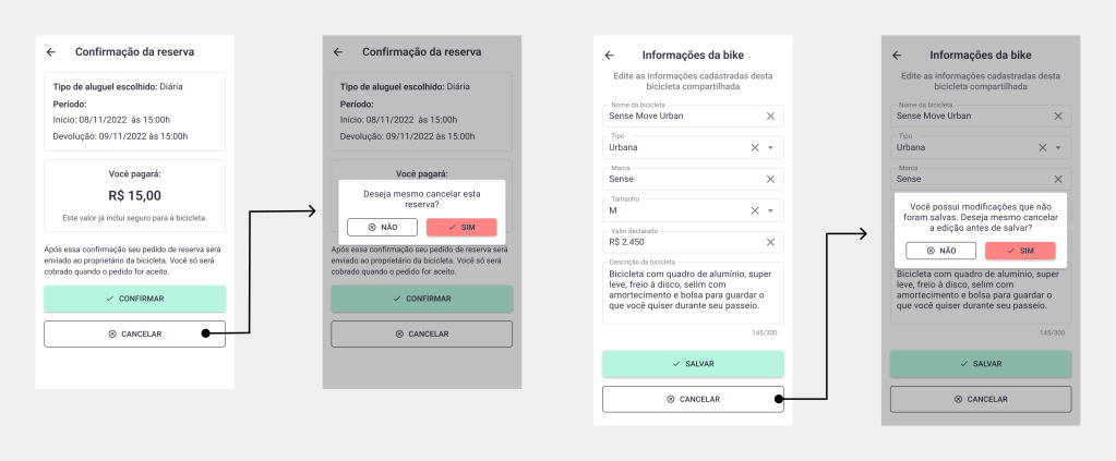
Alerts about destructive actions and the option to confirm these actions to help the user avoid errors. Nielsen’s heuristic n.5: Error prevention.
Decision 6
Minimalist visual design, focused on essential information and actions to avoid user distractions. Nielsen’s heuristic n.8: Minimalist aesthetics and design.
Results and thoughts
Building the project from scratch, with all these UX process stages that generate a vast amount of information and documents, certainly helped enhance my organizational skills. I believe this organization also makes a significant difference in the success of the process.
Managing time for the development of a project like this, especially the critical prototyping phase, was a challenge. I completed the project without some features I would have liked to include, such as the educational section about traffic safety measures, georeferenced information about bike lanes, cycle paths, and bike parking, and the section about service partners, companies offering discounts. Since these were not essential features for this initial version, I chose not to prioritize them. Despite the desire to always deliver everything, it’s necessary to understand that we always have to prioritize some things and postpone others. It’s part of the process! For the future, I plan to include them and also create a web version for the solution, as a web platform can run on any device without the need for installation.
Hi-Fi Prototypes
You can check the prototypes at this link! 😉
